Case Study: Giving an Accomplished Artist's Website the Clarity Her Work Deserves
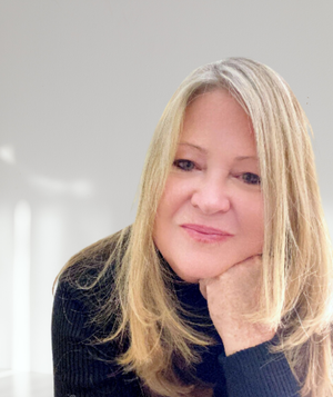
Lynda Fay Braun is a Naples, Florida–based artist with an MFA from Cornell, an informal mentorship under Agnes Martin, and a career spanning decades — her work held in collections including Neiman Marcus and Cornell's Johnson Museum, and licensed by the Ritz-Carlton, JW Marriott, and Hyatt Regency. It's the kind of career that deserved a website doing it justice. Hers wasn't, quite yet.
The Starting Point
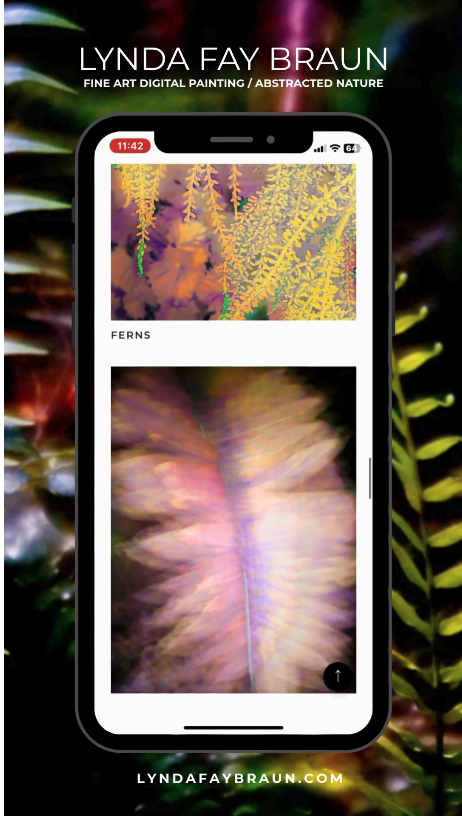
Lynda had been on Wix for years and was updating the site herself. An independent review had also flagged real structural problems — too many categories, no clear path for visitors, no sense of what to look at first. She was specific about what she didn't want: anything that made her site feel like "art for over the couch."
She also had an enormous amount of work to draw from — hundreds of images across more than a dozen series, built up over a long and prolific career, with no clear sense of which pieces told her story best. In her own words going in: "I have so much work. I was concerned about how to curate it."
The Approach
The first real decision wasn't visual — it was structural. We moved her from Wix to Squarespace, a platform better suited to image-first portfolio presentation, and built the site around a simple principle: curation over accumulation. Rather than presenting her entire archive with equal weight, we picked her strongest collections, narrowed each down to a focused set of works, and let the rest of her archive remain reachable but secondary.
That curation work turned out to be the heart of the project. Asking Lynda to make hundreds of individual decisions alone wasn't realistic, so we built a simple, repeatable process instead: she'd gather candidates into shared folders, I'd review and propose a cut, and we'd land on the final set together. One series at a time.
The rest of the site followed the same logic. Her photo restoration business and self-published photo books stayed on the site, but we didn't want them to compete with her fine art for a first-time visitor's attention. Her CV got fully reformatted and given its own page, with a short "Selected Highlights" section pulled onto her About page so even a casual visitor could see the weight of her career without downloading anything. A licensing and commissions FAQ answered the practical questions her consultant and hospitality clients actually ask, without ever turning the site into something that felt like a storefront.
Copywriting ran through almost every page — About, her collection introductions, her retouching services, even her 404 page — all written to sound like her, not like generic website filler. Where she'd already written something strong herself, like her published artist statement, we kept it untouched. Where material existed but was buried (a biography hidden deep in her old site, a glowing third-party review, press features she'd never linked to), we found a proper home for it.
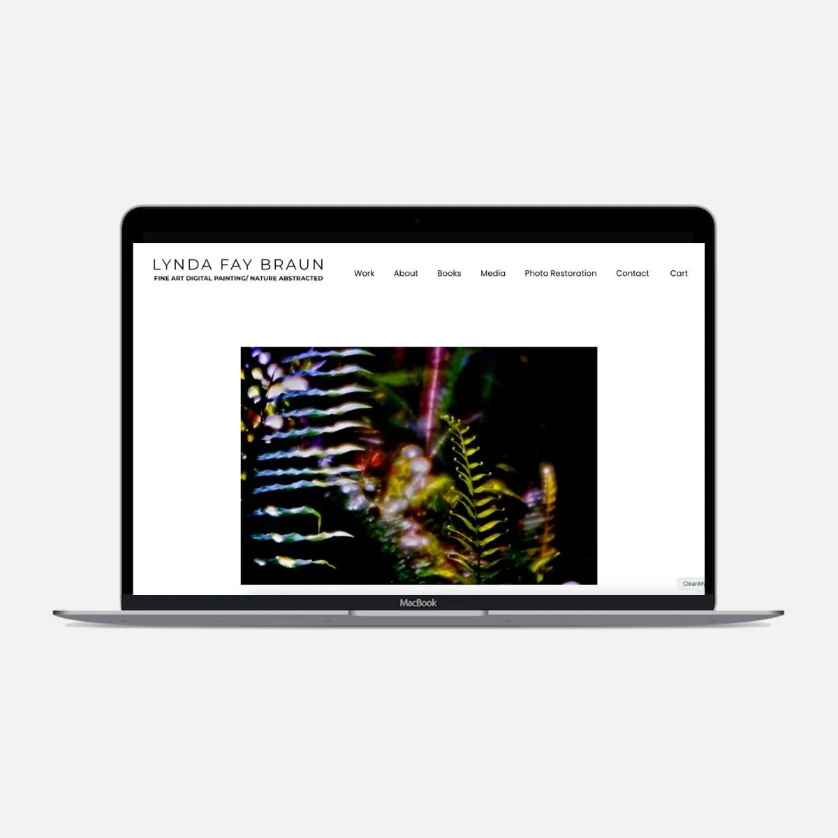
Portfolio website for Lynda Fay Braun.
Where It Got Hard
Not every part of this was simple, and a case study isn't honest if it pretends otherwise. Lynda has produced an extraordinary volume of work over a long career — more than a dozen distinct series, hundreds of images. Narrowing that into a focused, coherent presentation took real collaboration: she'd gather candidates, I'd propose a cut, and we'd land on the final set together, one series at a time rather than all at once.
There were also real logistics to solve along the way: a file-sharing workflow designed to facilitate the collaboration around curation, a domain and email transition handled carefully so nothing broke, and a frank conversation about why a personal inbox isn't the same thing as an email marketing tool — a distinction that trips up a lot of visual artists.
The Result
The site launched with real structure for the first time: curated collections, a properly presented CV and biography, licensing information consultants could actually use, and a photo restoration and books business that didn't compete with the fine art for attention.
The results came fast. Lynda sent one announcement email to her existing client list and made three sales in a single day. In her words: "The organization of my portfolios makes so much more sense... I'm getting very positive feedback from friends and art collectors in general."
What This Project Reinforced
Every artist I've worked with who says "I have too much work and I don't know how to show it" is describing the same problem in different words. The solution isn't a bigger site. It's a more deliberate one — fewer things, chosen with intention, presented with enough structure that a visitor (or a juror, or a consultant) knows exactly where to look first.
Lynda built an extraordinary body of work over a long career. The site just needed to finally catch up to it.