Anatomy of a Successful Artist Portfolio Website: Paweł Jońca, Illustration Artist
One of Poland's most renowned illustrators, Paweł Jońca is an illustration artist based in Warsaw. He works with magazines and weeklies, creates illustrations, book covers, and posters, among many other things, and has a roster of notable Polish and international clients that includes Apple, Newsweek. Forbes Women, Oprah Magazine, The Hollywood Reporter, among others.
I elected to showcase this website because I believe there is so much about it that we can all learn from. Admire Paweł’s amazing work when you visit his site, but before you do, let me point out a few web design practices that I believe make this website stand out from the competition.
Many of these website strategies and best practices are simple things that we can also implement on our own sites right away.
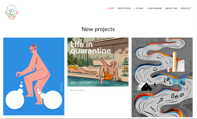
Pawel Jonca’s Home Page
What I Love About This Website
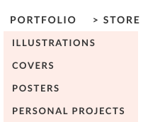
Drop Down in Navigation Bar
The site features a compelling logo that immediately captures my attention. It appears to be a self-portrait of the artist, and it successfully conveys a modern, playful, colorful aesthetic.
A clear navigation bar that encourages visitors to check out his work, or shop in his store.
The area above the fold is reserved for new work, which immediately gives visitors a reason to return to the site periodically, without having to drift down a rabbit hole to find what’s new. It also tells search engines that this site is relatively active with periodic content updates, which helps rankings.
The area below the fold features links to his portfolio and shop, as well as 3 images of past work. Placing a brief spotlight on past work is a great way to highlight notable works (for example, this could be prints or products that continue to sell particularly well, or projects that received important press coverage, for example).
The area below the fold on his Home Page also features a preview of his Instagram feed, with an invitation to follow (Instagram is likely a potential source of new international clients). Notice how the artist co-opts the platform’s conventions by publishing spot illustrations in ‘organic’ blob forms. I love that so much. It’s a small detail that says a lot about his approach to creativity.
The artist’s portfolio of work is organized into four categories, which is no easy feat for someone with a long and successful career. This tells us that these are the types of projects he prioritizes, and that probably are in his zone of genius: Illustrations, Covers, Posters and Personal Projects.
The “About” Page
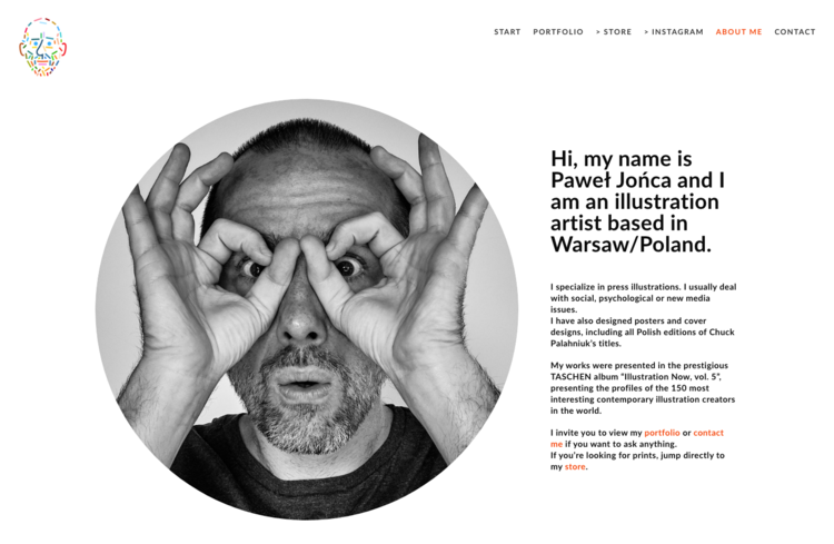
In his About page, the artist features a large portrait photo that conveys something about his personality (who wouldn’t want to work with a professional who is also fun?).
Notice, that although the copy in the About page headline is brief, it includes a few strategic keywords that will help search engines find him: His name, his profession, and his location.
The artist provides not only information on the types of projects he typically takes on (press illustrations, posters, cover designs), which is a great way to attract more of the same, and at the same time subtly discourage projects that are not a good fit.
Jońca also mentions certain topics found in his work (social, psychological or new media issues - also keywords) that will capture the attention of art directors who routinely manage editorial projects that deal with that subject matter. It’s easy to imagine that if they weren’t previously aware of Paweł Jońca, they’d be compelled to ‘bookmark’ this artist’s site for future projects.
Although multiple achievements are spelled out in the area below the fold, the copy above the fold highlights an important milestone (inclusion in a prestigious Taschen album), that will get noticed by potential new clients everywhere — within seconds. Again, no need to dig around for that info.
The copy includes clear calls to action that invite the visitor to contact him, explore his work or shop in his store. Notice that each of the links are also highlighted in a contrasting color, which ensures that they won’t be overlooked.
Below the fold are additional details about clients, awards, exhibitions and press — all the social proof you might want, easily accessible and in one place.
Finally, the website footer contains links to every social media platform the artist has a presence on, and each offers a slightly different look at his work (including brief process videos on YouTube).
Head over to the website, and check it out for yourself. Then, give him a follow on Instagram, if you can!
Paweł Jońca Website: https://paweljonca.com/en
Follow Paweł Jońca on Instagram: @PawełJońca


