Five Ways to Style Your Online Portfolio with Gallery Layouts
This article reflects an earlier phase of my work focused on practical guidance. Today, I apply these principles through private collaborations with artists and independent practitioners who want their work presented with clarity and intention.
If you’re an artist, illustrator or designer, you probably know that most online portfolios are presented in a simple grid format, but did you know that there are other ways to present your work visually, while still keeping your portfolio straightforward and easy to navigate? In this post, we’ll review some of the options available in Squarespace 7.1 portfolio pages. You’ll see that there are other ways to present your work visually, while still keeping your portfolio straightforward and easy to navigate.
One of the big improvements in Squarespace 7.1, over Squarespace 7.0 was the ability to create a portfolio page. The portfolio page is designed to gather all your portfolio categories under one umbrella, while keeping things highly organized. For example, if you’re an illustration artist, one category in your portfolio might be ‘people’ and another might be ‘floral.’ The portfolio page allows your visitors to quickly bypass ‘people’ if they’re actually only interested in floral illustrations. This benefits your end user. Ideally, they’ll love what they find in the floral sub-page so much that they’ll go back and review your entire portfolio, right?
Simple Grid
Before we look at other options, let’s start with the standard portfolio layout. This option arranges all thumbnail images in a simple grid layout, with title text for each sub-page appears below the images.
Grid with Overlay
This layout arranges the portfolio thumbnail images in a grid layout. The title text for each sub-page overlays the images. You can also customize the overlay color to match your brand, or adjust the size of the titles, depending on the overall effect you’re trying to achieve.
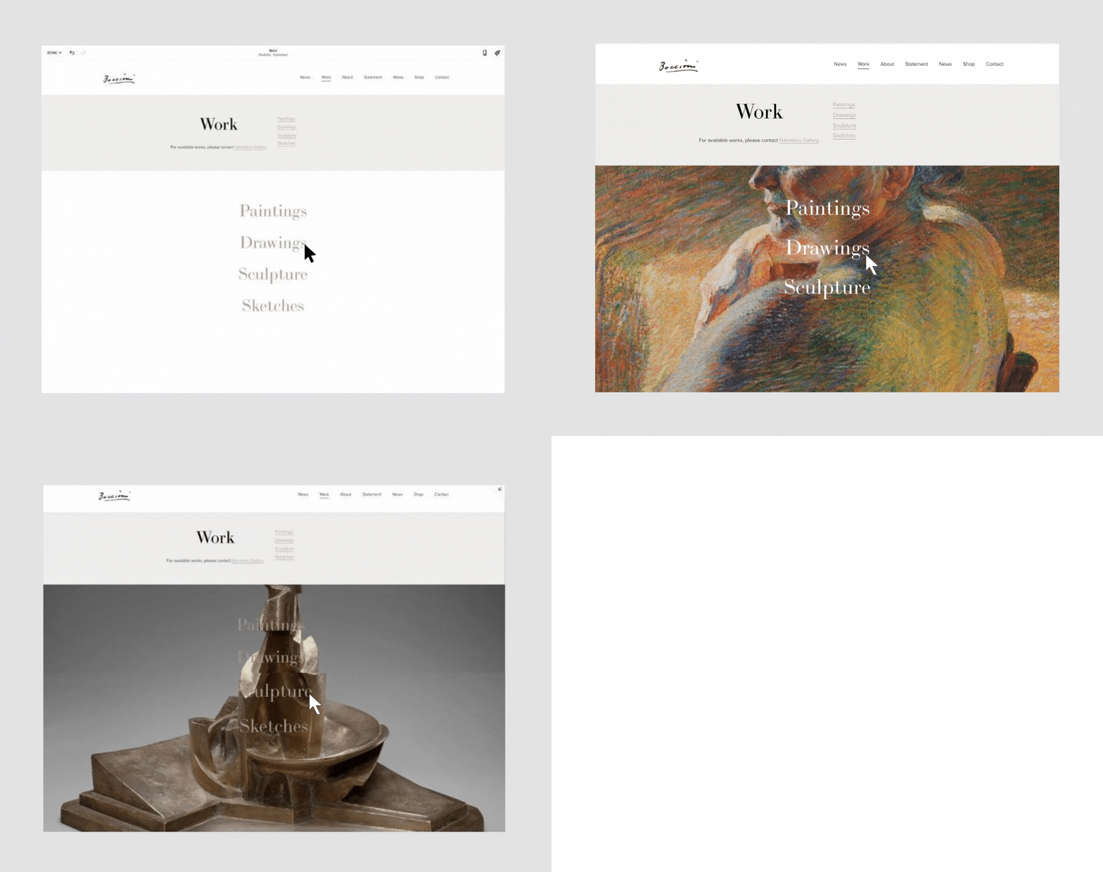
Hover with Thumbnail Images in Background
This layout setting displays your sub-page titles in a stacked or inline layout. When you hover over a title, the sub-page thumbnail image replaces the section background, so it adds an element of interactivity to your site.
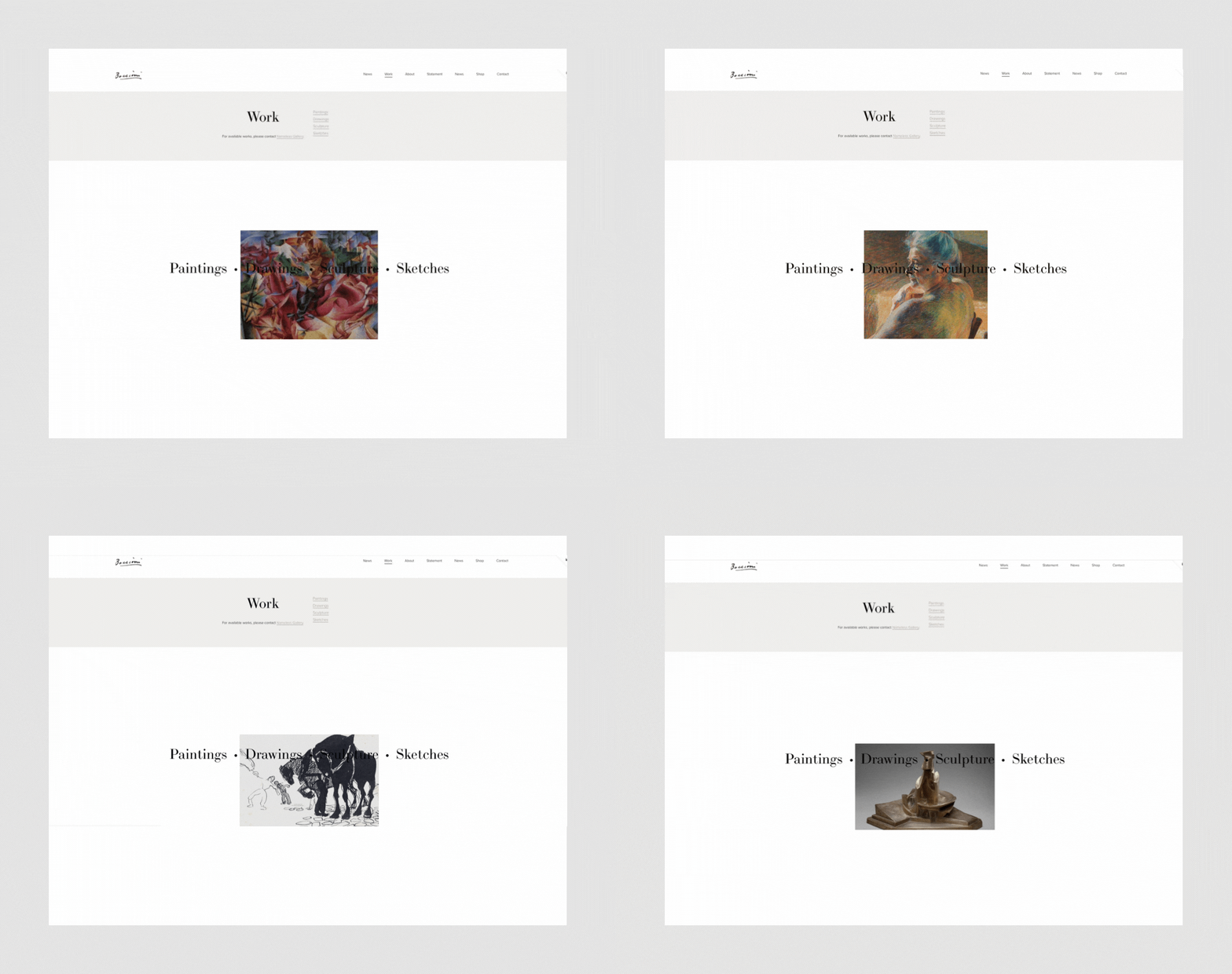
Fixed Hover
The “hover:Fixed” layout option displays your sub-page titles in a stacked or inline layout. But this time, when you hover over a title, the sub-page thumbnail displays smaller in a fixed position in the section. In this example, the image is displayed in the center of the section.
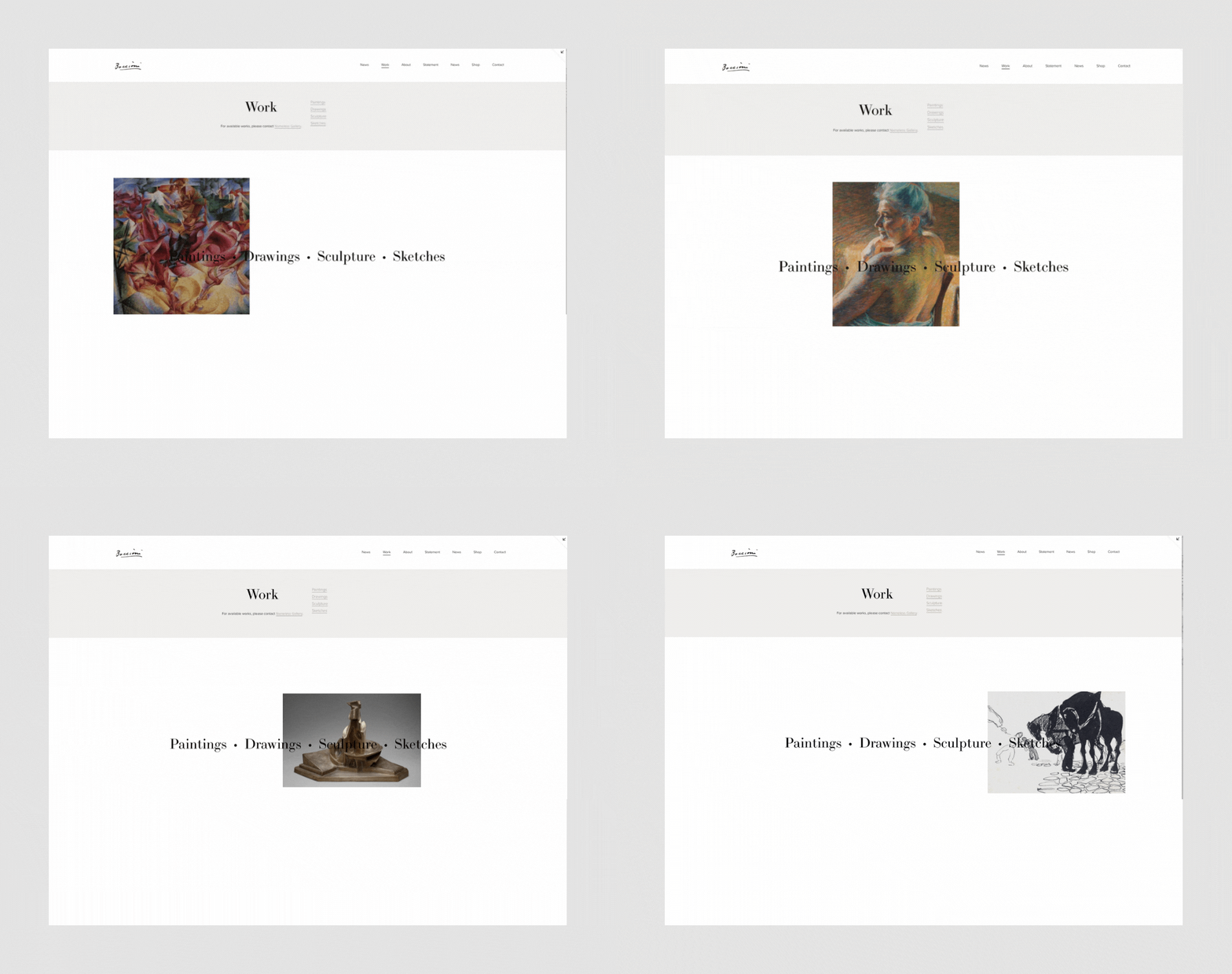
Hover: Follow Cursor
The “Follow Cursor” Layout option displays your sub-page titles in a stacked or inline layout. As you hover over each of the titles, the sub-page thumbnail displays smaller and follows the cursor as it moves across the screen.
Additional Styling Options
OK, so now that you’ve seen what’s possible, you should know that Squarespace has made it easy to further customize each of these gallery layouts. For example, you can change the color of your image overlays, change the color of your fonts, adjust the spacing between images, or change the overall size of your images sizes, for example.
To achieve these layouts and explore additional settings and effects on your portfolio page in Squarespace 7.1:
Click Edit on the portfolio page.
Hover over the portfolio section and click the pencil icon.
Under the Format tab, change the layout or make style changes to the current layout, like spacing, image aspect ratio, and hover effects.
Click the Background tab to add a background image or video.
Click the Colors tab to choose a color theme. Changes in this section override global styles in the site styles panel of your site.
Hover over Done and click Save.
It’s impossible to cover all the alternatives in one blog post, so the best approach is to create a portfolio page and upload your images so you can play with all the options and see what fits your work best. Remember that you can start a free 14-day trial in Squarespace — no credit card required — to try it out and see if you like it. If you have questions, feel free to get in touch, and let me know what you think!


