Round Up: Three Inspiring Artist/Activist Portfolio Website Examples
If you’re an artist who is interested in building momentum around a particular social, cultural, environmental or political issue that is meaningful to you, and you’ve been struggling with how to present your work on your website, this post is for you.
In this post, I’ve selected three examples successful artist websites, each very different, that showcase various web design and communication approaches to the role of “artist/activist.” I will review each approach below, but before I do, let me briefly introduce these amazing artists.
Jodee Mundy OAM is an Interdisciplinary Artist and Creative Director whose work is focused on creating awareness and dialogue around disability and inclusiveness. She is based in Melbourne, Australia.
Zaria Forman travels to remote regions of the world to collect images and inspiration for her pastel drawings, which document climate change. She is based in upstate New York.
Malene Barnett is an artist activist who is redefining what it means to be Black and female in the contemporary art world. She is based in Brooklyn, New York.
These artists have put considerable thought into how they want to share their work with the world, and by any measure, they have been wildly successful. Let’s take a closer look at how they present their work.
Jodee Mundy’s Website
JODEE MUNDY OAM
Jodee Mundy OAM is an Interdisciplinary Artist and Creative Director who is committed to producing high quality theatre works, public events, installations and artistic interventions that bring together diverse cross sections of people who may not regularly encounter one another.
Her website, Jodee Mundy Collaborations, is focused on attracting collaborations and partnerships to promote “the value of live performance and communities and the ability of the art to redefine and skew the notions of inclusiveness.”
How her website helps her advance her work
The home page features a looping video of Jodee communicating in sign-language, and contains the words collaborations, community and connect. There is no ambiguity here. Crystal clear messaging is essential on the home page.
Below the fold on her home page, we quickly learn about the artist’s “why.” The artist’s work is motivated by her personal experiences growing up in a family where she is the only person who hears, as everyone in her immediate family is Deaf. Sharing her story up front provides a compelling invitation to explore her site, and her work, further.
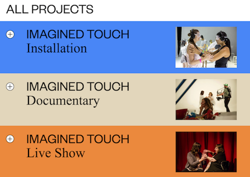
A section titled “All Projects” includes examples of successful collaborations and partnerships, with images, brief introductions and quotes from participants.
Under a section titled “Inclusion” the artist highlights an important outcome of past projects that will interest the kind of partners she is looking for -- those who are interested in “increasing participation for marginalised communities in the arts locally, nationally and internationally.” She also includes an impressive list of past partners and awards. This is a very effective way to underscore why someone should work with her.
Under “Research,” the artist highlights her leadership and involvement with arts and culture projects focused on disability and promoting inclusion, proving that her involvement is deep and far-reaching, with networks both at a local level and an international level.
In a section titled “Residencies and Workshops,” Jodee provides information on a variety of professional activities she’s been involved with, and has included images. This is a powerful way to communicate her leadership and expertise, which makes it very easy for her ideal audience to consider reaching out and inquiring about potential collaboration.
Jodee Mung Collaborations: https://jodeemundy.com/
Site Credits: Forde + Nicol
Zaria Forman’s Website - Home Page
ZARIA FORMAN
Zaria Forman’s large-scale photorealist pastel paintings of melting glaciers, icebergs floating in glassy water, and remote, icy landscapes not only celebrate the beauty of those landscapes, but bring attention to the global climate crisis and, in a sense, sound an alarm on what’s at stake.
For over a decade, Zaria has traveled to remote locations, and has flown with NASA on several Operation IceBridge missions over Antarctica, Greenland, and Arctic Canada, and has been an artist-in-residence aboard the National Geographic Explorer in Antarctica. On each of her expeditions, the artist takes thousands of photographs which she uses to inform her art work.
“I work on this scale and with this degree of realism, to transport you to these distant, fragile landscapes,” she says. “If you can experience the majesty of these places, you will fall in love with them as I have. When you love something, you want to protect it.”
Everything surrounding her artistic practice, including her exhibitions and speaking engagements such as her TEDTalk, (“Drawings that show the beauty and fragility of Earth”), carries an emotional appeal that she hopes will help viewers see themselves as ‘part of a movement in which every second counts” Her website provides a welcome, and detailed, introduction to her efforts on every front.
How her website helps her advance her work
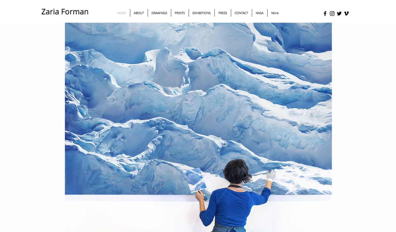
The home page features a single image of the artist at work on a large-scale painting, which highlights not only the scale of the work, but also the scale of her subject matter. The image is striking in its beauty, but also accurately conveys what her work is about.
The navigation bar contains 8 categories or tabs, that lead to her art (“Drawings,” organized by collection); her shop (“Prints” available through Artstar); “Exhibitions;” “Media;” “NASA” (for anyone interested in learning more about her involvement with that initiative); and “More,” where she provides specific information on how individuals can reduce their carbon footprint.
On her About page, Zaria has embedded a time-lapse video produced by Apartment Therapy that shows the artist at work. Below, she has included a brief bio that includes links to select and notable collaborators and media, which instantly boosts her credibility within the art-industry and the Scientific community. This is no easy feat, and Zaria’s work clearly stands apart.
The overall design of her site is pretty straightforward, so I would say that the strength of her site lies in organizing and conveying information clearly and with her varied target audiences in mind.
Zaria Forman Website: https://www.zariaforman.com/
Site Credits: N/A
Instagram: https://www.instagram.com/zarialynn/
MALENE BARNETT
From her sculptural ceramic tiles and vessels to mixed media paintings to handwoven rugs, Malene describes herself as “equal parts artist, anthropologist, and activist.”
In addition to her own artistic work, Malene is also the founder of the Black Artists + Designers Guild, a global platform and curated collective of independent black artists, makers, and designers, and is on the board for CERF+, an organization that provides emergency loans to artisans and craftspeople during natural disasters.
Beyond her paintings, ceramics and hand-knotted and hand-tufted carpets, Malene’s collaborations have spanned a range of projects; everything from creative work with political campaigns and local community service organizations to custom carpet work for blue chip corporations such as Viacom and Saks Fifth Avenue under her own label, Malene B. Malene has also been widely praised in the media for her efforts around increasing diversity within the design industry.
How her website helps her advance her work
A website cover page provides a clear and succinct introduction to her multiple activities, with a call to action that, in itself, is community-oriented in nature: “Join me on this Journey.” A visually-stunning image of the artist conveys, in less than 5 words, what she’s all about. She’s an artist on a mission.
A marketing pop-up on her site also reflects a similar sentiment. The Call to Action is “Together We Rise,” which is beautifully consistent with her messaging throughout.
Malene’s site follows a fairly traditional organization, with a navigation bar that makes it easy to quickly find everything.
Under “Work,” she’s included separate portfolio sub-pages for new work, ceramics, paintings, carpets, custom work and collaborations.
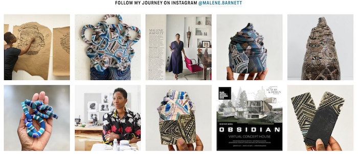
Under “About” she has included several sub-pages where we can learn more about her artistic process, or discover her expertise as an international speaker and cultural influencer. She has also included a live Instagram feed, which is a great way to encourage visitors to engage with her online, and also become followers.
Malene has included a live Instagram feed on her About page, which is a great way to invite visitors to follow her and engage with her on social media.
Under “Speaking” Malene has included a specific list of prepared speech topics, which is followed by an impressive list of speaking engagements and images. Notice the clear call to action: “Book Malene.”
A brief introduction on the sub-page for “Press” lists impressive media mentions, and allows visitors to quickly filter content by type of media.
She’s organized lectures and gallery exhibitions under an “Events” sub-page in chronological order, and included images for greater impact.
Under “Store,” she’s also organized by work category, for clarity and ease of navigation.
Her “Journal” follows a blog structure. In her journal she highlight thoughts, impressions and other creative activities such as photography, travel and reading (all of which inform her work).
A subscription form and links to her social media are included in the footer and are visible across the site.
Malene Barnett: https://malenebarnett.com/
Site credits: Jan & Susan
Instagram: https://www.instagram.com/malene.barnett/
As you may have noted, each of these artists is active in a different market niche, and their activism has led them down divergent paths. In each case, though, their websites are designed to successfully highlight their artistic work and shine a spotlight on a cause or issue they care deeply about. This approach is helpful to continue building the kind of collaborations that will help advance their mission on both the artist and activist fronts.
Thinking about these artists, and their sites, in relation to your own work, what resonates most with you?
The key takeaway is to start by determining exactly what you would like your site to help you accomplish. Based on what you care about most, what will the primary driver for your site be?
Consider also the kind of work you would like to create in the future, and who you might want to be involved with on the activist front? Is your vision consistent with what you are doing now, or do you need to make changes to the way you are introducing your work?
Would you like to collaborate with existing organizations, or individuals, and contribute to ongoing efforts? Or, have you dreamed of starting an initiative of your own? Are you interested in teaching? Or collaborating with others who teach or conduct research? In an ideal long-term scenario, who would you love to collaborate with? And, what kind of collaboration outcomes would make you feel like you’ve contributed in a meaningful way?
Once you’ve given this some thought, and you’ve gained some clarity, that’ll help guide your decisions about the kind of content you’ll want to include on your website, what you should probably leave out, and how you’ll organize the content to make it easier for visitors to take action once they’ve arrived on your site.
Your site messaging, your visuals, and all of your calls to action can contribute immensely to moving your work along in the direction you desire. I hope these artists have provided a measure of inspiration along the way. My guess that in each of these cases, the artists cannot separate their art from their activism, as they are integral to each other. And, it would be important to point out that what you see on their sites is the product of many years of work. Everyone’s creative journey looks a little different, and I offer these examples as a starting point for what could be if you find that your work is leading you in a similar artist/activist direction.
Tell me, which of these approaches are most closely aligned with your vision for your work? Comment below.


